As a fitness business owner, having a professional website can help you attract and retain clients. A well-designed website can also establish credibility and trust with your audience.
However, building a website from scratch can seem daunting, especially if you don't have any web development experience.
Don't worry, in this blog post, we'll walk you through the process of setting up a website for your fitness business.
Let's get started…
Define your website goals and audience: Your website should cater to the specific needs and preferences of your target audience, whether that's one-on-one Personal Training, or group fitness classes, etc.
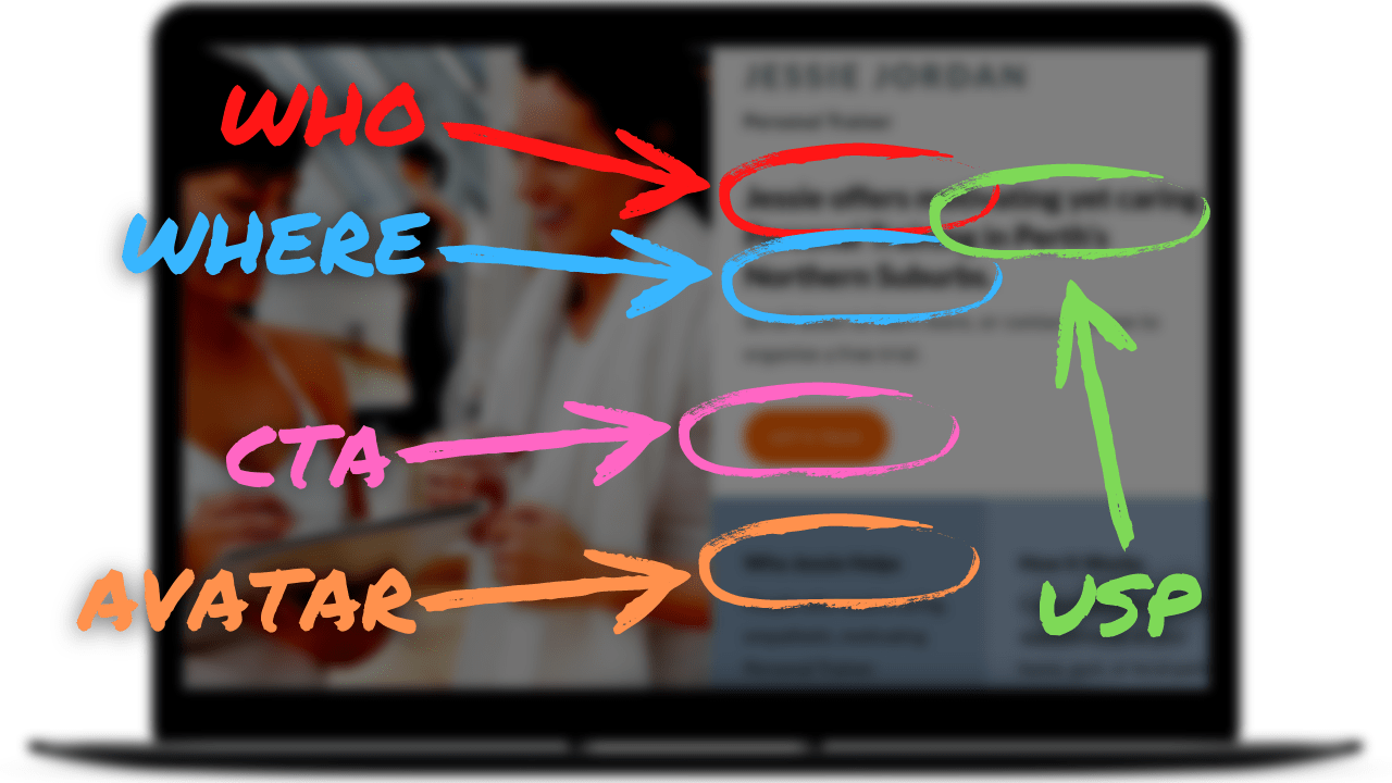
It's important to keep your ideal client or target demographic in mind. This is where the concept of an "avatar" comes into play. Your avatar represents the type of person you want to attract as a client or member.
By defining your avatar and tailoring your website to their needs, you can create a more personalised and effective experience for potential clients.
This approach can help them feel more connected to your business and more likely to become a customer.
Choose a domain name: A domain name is the address of your website. Choose a name that reflects your brand and is easy to remember. See our ‘How to Choose a Domain’ blog for more information about domain names.
Select a hosting provider: A hosting provider is where your website's files will be stored and accessed by visitors. Compare hosting providers for their pricing, security features, and customer support. Choose a reputable hosting provider that offers fast loading times and reliable uptime.

Choose a website builder or content management system (CMS): There are many website platforms to choose from, such as WordPress, Squarespace, Weebly and Wix. These platforms offer pre-built templates and customisation options. Research and compare features to find the one that suits your needs and budget.
Set up your website's template: Select a template or design your website's layout, keeping in mind your branding and target audience. Make sure it's visually appealing, easy to navigate, mobile-responsive (ie. the layout automatically adjusts the layout of your website based on the size of the screen it's being viewed on), and optimised for fast loading speeds.
Create a site map and design the layout of your website: A site map is a visual representation of the pages on your website, which helps you organise and structure your content. Once you have your site map, it's time to design the layout of your website. This includes choosing a colour scheme, fonts, and images that are consistent with your brand and visually appealing to your target audience.

Create a clear and concise homepage: Your homepage is the first impression visitors will have of your website. Make sure it clearly communicates what you offer and how you can help your target audience.
The importance of the 'above the fold' section on your website cannot be overstated. This section refers to the information a visitor sees on their screen before scrolling.
Just like with newspapers, this part of your website needs to capture the visitor's attention and entice them to explore further. It should serve as a summary of your entire website, including the business name, unique selling proposition (USP), and location (for brick-and-mortar businesses).
Additionally, it should provide a brief summary of your business and include a clear 'call to action' with either a form or a link to encourage visitors to take action. By effectively designing and utilising the 'above the fold' section, you can increase the chances of visitors engaging with your website and ultimately converting them into paying customers.
Showcase your services and offerings: When designing a website, it's important to focus on your USP. This is what sets you apart from other fitness businesses and can help attract customers.
Your USP should be prominently displayed on your website, ideally 'below the fold'. It should be clear and concise, highlighting what your business does best and what makes it unique.
For example, you might specialise in a particular type of workout or offer personalised training programs. Whatever your USP is, make sure it's front and centre on your website to help attract potential customers.
Create separate pages for each service or offering you provide, including descriptions, pricing, and any other relevant information.
Create an about page that connects with your audience: Your "About" page is an opportunity to connect with your audience and establish a personal connection.
It should tell your story, mission, and values to build trust with your visitors.
However, it's important not to make this section solely about your business. This page should highlight the problems your business specialises in solving. By listing these problems, you can show your avatar that you understand and empathise with their challenges and are the best fit to help them solve their problems.
Remember, every business exists to solve a problem, and your "About" page should reflect that.
Include client testimonials and success stories: Social proof is a powerful tool to establish trust and credibility with your potential customers.
Including testimonials or success stories on your website is a great way to showcase how you have helped people in the past.
Your avatar wants to see that people similar to them have had success in working with you to solve similar problems. This creates a sense of relatability and encourages them to take action towards working with you.
Don't be afraid to showcase your best success stories and let your past clients do the talking for you.
Create high-quality content: Your website content should be engaging, informative, and relevant to your fitness business. Fill your website with high-quality content, including images and videos for better user experience. You may also want to add a blog section to share fitness tips and updates, to provide value to your audience and showcase your fitness expertise and services.
Optimise your website for search engines: Search engine optimisation (SEO) is the practice of optimising your website to rank higher in search engine results pages. This involves using relevant keywords and metatags in your website content, optimising your site structure and navigation, and obtaining backlinks from other reputable websites. By optimising your website for search engines, you can attract more visitors and grow your fitness business.
Integrate social media: Link your website to your social media accounts and include social media icons and sharing buttons. This can help increase your social media following and website traffic. See our ‘Setting Up Social Media’ blog for more information about creating social media accounts.
Add contact information: Make it easy for potential clients to contact you by adding your contact information, such as your phone number and email address, to your website.
Include clear calls-to-action (CTAs) throughout your website: The primary goal of a Fitness Business Website is to get your avatar to take action. This is where your offer and call to action come in.
In most cases, this involves the person contacting you through various means. You need to provide a compelling reason or offer that entices them to reach out to you. Then, make it easy for them to do so with a simple, low-friction way, like a webform.
Your call to action should align with the unique selling proposition of your business and clearly communicate the benefits of taking that action.This could include signing up for a free trial or e-book, booking a consultation, or purchasing a package that helps solve a problem your avatar faces.
Make it easy for visitors to take the next step by including clear CTAs throughout your website. Place it in strategic locations, such as the 'above the fold' section or the end of a blog post, to encourage visitors to take action.
Test and optimise: Regularly test and optimise your website's performance, including page load times and user experience. Make adjustments based on analytics data to improve your website's effectiveness. Regularly update your site with fresh content, promotions, and announcements to keep your audience engaged.
Conclusion
Your fitness website is a powerful tool to help you stand out in a crowded industry and attract new clients to your business.
As the first impression for potential clients, it's important to make a great one. Creating a website that reflects your brand, has a clear layout and easy navigation will help you achieve this.
Remember to define your target audience, highlight your unique selling proposition, and showcase social proof with testimonials and success stories. Your website should have a clear call-to-action that provides a compelling reason for visitors to contact you.
By keeping it simple and focusing on the customer, you'll be well on your way to a successful fitness website that helps you grow your business.


